Web Design

Why Responsive Web Design?
I have been providing professional website and email hosting for a small number of clients since 2007, and in the early days, I built a handful of basic websites. During the Corona Virus pandemic of 2020, I decided to completely update my web design skills, and am now building modern, ‘responsive, mobile-friendly’ websites, primarily for charities, small businesses and individuals. These are websites that automatically reformat the content of the pages to fit better across the width of the user's screen - desktop computer, laptop, tablet, phone, etc. - thereby making the pages readable and bandwidth-friendly across all platforms. With mobile devices now accounting for the majority of Internet usage, it is now more important than ever that websites are built in a responsive and mobile-friendly manner. Otherwise, visitors using mobile devices, struggling to fully access the content, may well leave the site and go elsewhere. August 2018 figures provided by the UK Office for National Statistics show that “Mobile phones or smartphones still most popular devices used to access the internet”. More recent figures (August 2019) provided by ONS show that “Among all adults, 84% had used the internet “on the go” in 2019, using a mobile phone, smartphone, laptop, tablet or handheld device." Furthermore, and very importantly, on April 21, 2015, the world’s largest Internet search engine, Google, boosted the rankings of mobile-friendly websites, whilst warning that “...pages designed for only large screens may see a significant decrease in rankings in mobile search results.” .
This very website you are viewing right now is an example of one of my responsive websites. Other responsive websites I have built are:
Jon Paul Entertainments
Bob Grainger Photography
The PAT Tester
Ystradgynlais Volunteer Centre
Frizenham Farmhouse B&B
Parish of Clydach
Selclene Ayrshire
Rainbow Cleaners
Tees World
A small number of others are currently being developed.
How Does Responsive Web Design Work?
The main characteristic of a responsive, mobile-friendly website is that the content of each page will automatically rearrange and adapt itself to maintain readability and functionality regardless of the width of the user’s display - from the wide screens of desktop computers, down to the narrow displays used by mobile phones. Very importantly, there is no need for the user to keep scrolling left and right to read the content and, in fact, there wouldn't actually be a left/right horizontal scrollbar at the bottom of the screen, as there simply wouldn't be the need for one.
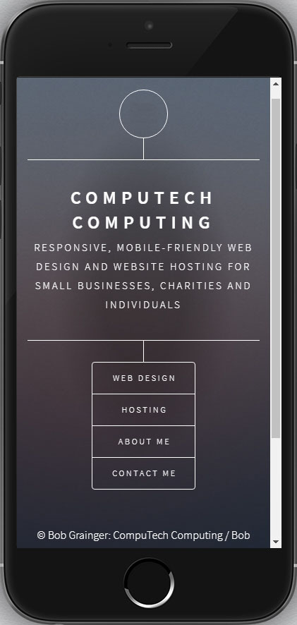
To demonstrate the power of responsive web design, compare the following two images which show how this very website, which has been built to be responsive, would appear on both an iPad and on a smartphone. Notice how the content of the web page formats itself to suit the width of the display. In particular, notice how the four-item menu appears horizontally (side-by-side) on the wider iPad screen but then, due to the limited width available to it, the menu switches to a vertical (stacked) format when viewed on the much narrower smartphone. Notice how the content fits perfectly across the width of both displays and how everything is very easily readable and usable, with no need for a left/right horizontal scroll bar along the bottom. The magic of responsive web design in action!


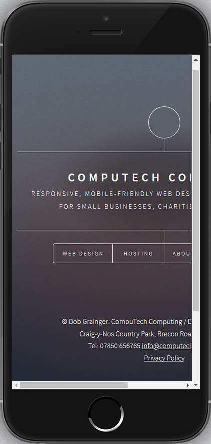
Now compare the two images above with the one here to the left, which shows how an old-school, non-responsive version of the same website might appear on the narrow width of a smartphone screen. Because this version of the website had been built in a ‘non-responsive’ manner, there has been no reformatting of the content of the web page to suit the width available to it and, therefore, it is very difficult and frustrating to use on such a narrow display, mainly because much of the content of the website is hidden from view, and the user would need to keep scrolling left and right to be able to take in all of the content (note the horizontal scrollbar down at the bottom). NB. I have not provided additional images to demonstrate how this non-responsive version of the site would look like on wider displays such as iPads and laptops, because it would probably look fine (although there might still be display/formatting issues with the relatively narrow screen of an iPad).

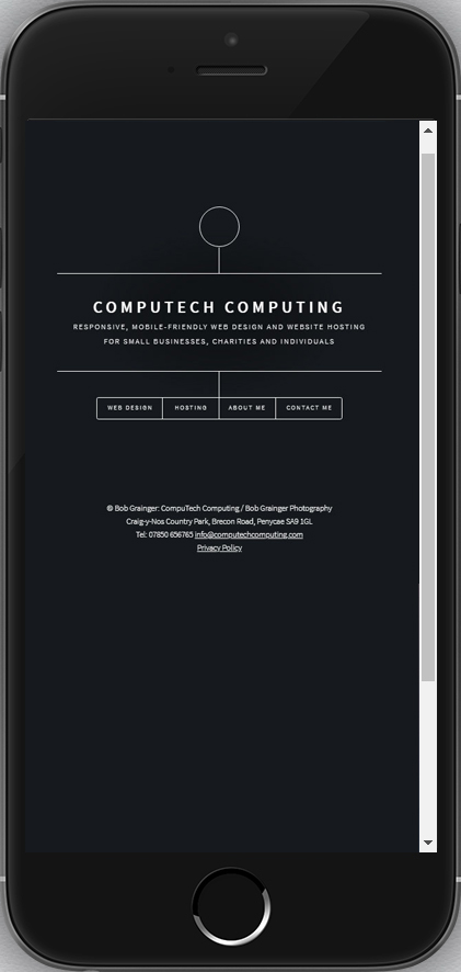
Sometimes what happens when viewing non-responsive websites on narrow screens, is that the pages don't appear as they do in the previous image, complete with horizontal scroll bar and the need to keep shifting the page left to right, but instead appear simply as miniature versions of the pages as they would appear on a full-size, wide screen. Take a look at the image to the left for example. Even though the full width of the page is shown fitting across the width of the smartphone screen, and that there isn't the cumbersome horizontal scroll bar as in the previous image, the only way to get it to fully fit across the narrow screen like this is to reduce the size of the page - a full-size page in miniature. The result is that everything appears tiny: text, images and, of course, links and menu buttons. The text is too small to be able to read comfortably, and the links and menu items are too small and too close together to be able to access easily.
Less Bandwidth and Data Usage
There is another benefit to having a well-designed responsive, mobile-friendly website: less bandwidth and data usage for mobile users. A well-designed mobile-friendly website would serve up to the user large size images when the page was being viewed on a large display such as a desktop monitor, medium size images when the page was being viewed on a medium-sized display such as a tablet, and small size versions of the same image when being viewed on a small display, such as a smartphone. The reason for this is quite simple: large displays require large size images because small images would need to be stretched to fill the screen, and the result would look very poor and pixelated. Small displays on the other hand, such as on mobile phones, really only need small-size images, and so downloading a large-size image would be unnecessary, as a smaller size image would have been sufficient. Downloading large images to mobile phones, when small versions would have been sufficient, would be a waste of bandwidth and data usage, not to mention time. A well-designed responsive, mobile-friendly website would detect the width of the display and would then serve up (download) the appropriate-sized image.
How To Tell If a Website Page is Mobile-Friendly
You can of course always use your mobile phone or tablet to get an idea as to whether a web page looks ok on those size screens - if it looks good, then it quite possibly is good. A much better method, however, is to use an online mobile-friendly checker which will not only show you how the web page appears visually, but can also provide you with a simple analysis of the page, in particular whether the text is considered too small or the clickable buttons and links are too close together. Google’s Mobile-Friendly Test page provides you with an accurate and easy way to check if a particular web page (but not the entire site all in one go) is responsive and mobile-friendly. Simply enter the address of the website page in question, with or without 'www', 'http://' or 'https://', click TEST URL, and you will then be presented with a statement in either green or red, stating whether the page is considered by Google to be mobile-friendly or not, respectively. Examples of website pages are: www.mywebsite.com, to view the result for the Home Page; www.mywebsite.com/contact.html (note how '.html' is required with this example), to view the result of the Contact Page, etc. NB. If you are viewing the result on a wide screen, then you will also be shown an image of how the page appears to Google; if you are viewing the result on the relatively narrower screen of a mobile phone, you will probably need to click on VIEW SCREENSHOT to be able to view the web page. One other feature of this test is that, if the web page is considered by Google not to be mobile-friendly, then you will also be given an explanation as to why it's not.
Charges for Web Design
I am still portfolio building and, as such, I am currently typically only charging between £200 and £300 for producing a responsive, mobile-friendly website, depending on what’s involved. To keep the cost down, I start by selecting one of ninety-five, high-quality professional responsive website templates, and modify them to suit the client’s material. You can view the complete set of live, interactive website templates here. If you also require professional website and email hosting, then this costs just £49/year. Also available, if you require it, is domain name registration, starting at £9.99/year. There is no VAT to pay on anything. Please see the Hosting page for full details about hosting and domain names.


